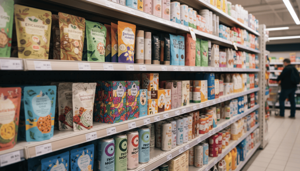
Ninety-three percent of purchasing decisions happen at the point of sale, yet most CPG brands treat packaging design as an afterthought. The brutal truth? Your product has roughly three seconds to capture attention on a crowded shelf before shoppers move on to competitors. In those crucial moments, strategic packaging design becomes your silent salesperson—either converting browsers into buyers or watching revenue walk away.

The Psychology Behind Shelf Appeal
Understanding consumer psychology is the foundation of effective CPG packaging design. When shoppers navigate store aisles, they’re operating on autopilot, making split-second decisions based on visual cues and emotional triggers.
Color psychology plays a massive role here. Red creates urgency and excitement, making it perfect for energy drinks and snack foods. Blue conveys trust and reliability—notice how many healthcare and cleaning products use blue packaging. Green suggests natural, organic, or eco-friendly qualities, while black often signals premium positioning.
But here’s what most brands miss: color effectiveness depends heavily on your product category and target demographic. A neon green energy drink might grab attention, but that same color could spell disaster for baby food packaging.
The Hierarchy of Visual Processing
Your packaging design needs to guide the consumer’s eye through a logical hierarchy:
- Brand recognition – Logo and brand colors should be immediately identifiable
- Product identification – What exactly is this product?
- Key benefits – Why should I choose this over alternatives?
- Supporting details – Price, size, additional features
This hierarchy must work within that three-second window. If consumers can’t quickly identify your product and understand its value proposition, you’ve lost the sale.
Design Elements That Drive Conversions
Typography That Sells
Typography does more than communicate information—it conveys personality and builds trust. Clean, readable fonts suggest reliability and professionalism. Hand-lettered or script fonts can convey artisanal quality or personal touch. Bold, angular fonts might suggest strength or intensity.
The key is ensuring your typography choices align with your brand positioning and target audience expectations. A premium skincare line using comic sans would immediately signal disconnect, while a children’s cereal using formal serif fonts might appear too serious.
Size matters tremendously. Your product name should be large enough to read from typical shopping distance—usually about three feet away. Secondary information can be smaller but must remain legible under store lighting conditions.
Strategic Use of White Space
White space isn’t wasted space—it’s a powerful design tool that can elevate perceived quality and improve readability. Premium brands often use generous white space to suggest luxury and sophistication. Think about Apple’s packaging or high-end cosmetics.
However, value brands might fill more space with information and graphics to communicate abundance and value. The key is intentional use of space that supports your brand positioning.
Imagery and Graphics
Product photography, illustrations, and graphics serve multiple functions in CPG packaging. They can:
- Show the actual product (especially important for food items)
- Demonstrate usage or results
- Create emotional connections
- Differentiate from competitors
- Support brand storytelling
High-quality imagery signals product quality, while poor graphics can make even excellent products appear cheap. This might surprise you: packaging photography often matters more than the actual product photography for initial purchase decisions.
Category-Specific Design Strategies
Food and Beverage Packaging
Food packaging faces unique challenges. Appetite appeal becomes critical—your packaging should make people hungry or thirsty. Fresh, vibrant colors work well for produce and healthy options, while rich, warm colors suit comfort foods and indulgent treats.
Transparency windows can be powerful for food products, allowing consumers to see quality and freshness. However, they also require consistent product appearance and excellent supply chain management.
Nutritional callouts and certifications (organic, non-GMO, gluten-free) have become increasingly important. These elements need strategic placement where they enhance rather than clutter the design.
Beauty and Personal Care
Beauty products often sell aspiration and transformation. Packaging design should reflect the desired outcome or feeling. Minimalist designs might suggest purity and simplicity, while ornate packaging could convey luxury and indulgence.
Functionality becomes crucial here. Pumps, squeeze bottles, and applicators aren’t just practical—they’re part of the user experience that influences repurchase decisions.
Household Products
Trust and efficacy are paramount for household products. Bold colors and strong typography can suggest powerful cleaning action, while gentle curves and softer colors might indicate gentleness for sensitive applications.
Before-and-after imagery or demonstrations of effectiveness can be particularly powerful in this category. Clear instructions and usage information also build confidence in purchase decisions.
Sustainability and Modern Packaging Trends
Environmental consciousness has shifted from nice-to-have to essential for many consumer segments, making sustainable product development a critical consideration that extends from packaging materials to overall brand messaging. Sustainable packaging design requires balancing environmental responsibility with shelf appeal and product protection—all essential elements that drive success in the consumer packaged goods industry.
Here’s what works: clearly communicate sustainable features without greenwashing. “100% recyclable,” “made from recycled materials,” or “biodegradable” should be prominent but not overwhelming. Use earth-friendly colors and textures when they align with your brand, but don’t sacrifice brand recognition for trend-following.
Minimalist Design Movement
The minimalist trend reflects consumer desire for authenticity and simplicity. This doesn’t mean boring—it means intentional. Every element should serve a purpose, whether functional or emotional.
Minimalist packaging can also reduce production costs while appearing more premium. It’s a win-win when executed properly.

Testing and Optimization Strategies
Even the most experienced designers can’t predict every market response. Smart brands test packaging designs before full rollouts.
A/B Testing Methods
Split testing different packaging designs in similar markets can provide valuable data. This might involve testing different colors, layouts, or messaging approaches in comparable retail environments.
Digital mockups in online retail environments can also provide insights, especially as e-commerce continues growing. How does your packaging appear as a thumbnail image? Does it stand out in search results?
Consumer Focus Groups
Focus groups can reveal emotional responses and decision-making processes that sales data can’t capture. However, be aware that what people say they prefer and what they actually purchase can differ significantly.
Eye-tracking studies can provide objective data about visual attention patterns and hierarchy effectiveness. These insights are particularly valuable for optimizing information placement and visual flow.
Measuring Packaging Design Success
The reality is that packaging design success should be measured in concrete business metrics, not just design awards or aesthetic preferences.
Key Performance Indicators
- Sales velocity – How quickly products move off shelves
- Market share growth – Capturing share from competitors
- Price premium sustainability – Maintaining higher prices through perceived value
- Repeat purchase rates – Converting trial to loyalty
- Shelf placement negotiations – Retailers wanting your eye-catching products in prime positions
Long-term Brand Building
While immediate sales impact is crucial, packaging design also builds long-term brand equity. Consistent, recognizable packaging creates mental availability—when consumers think of your product category, they think of your brand first.
This brand-building effect compounds over time, making future product launches more successful and reducing marketing costs for awareness generation.
Common Packaging Design Mistakes
Most businesses fall into predictable traps when designing CPG packaging. Here are the biggest mistakes to avoid:
Information Overload
Trying to communicate everything at once results in communicating nothing effectively. Priority hierarchy is essential—what’s the most important message for purchase decisions?
Ignoring Retail Environment
Designs that look great in isolation might fail on actual shelves. Consider lighting conditions, shelf positioning, and competitor proximity. Your packaging doesn’t exist in a vacuum.
Inconsistent Brand Expression
Packaging that doesn’t align with other brand touchpoints creates confusion and weakens brand equity. Your package design should feel like a natural extension of your brand personality.
Neglecting Practical Considerations
Beautiful designs that don’t protect products, are difficult to manufacture, or create supply chain challenges will ultimately fail. Form and function must work together.
Understanding your target audience remains paramount throughout the design process. Understanding your target audience remains paramount throughout the design process. Age, income, lifestyle, and values all influence packaging preferences and purchase triggers.
Successful CPG packaging design requires balancing multiple competing priorities: shelf appeal, brand consistency, practical functionality, cost effectiveness, and sustainability considerations. The brands that master this balance create packaging that not only converts immediate sales but builds lasting market advantages.
At Beast Creative Agency, we’ve helped numerous CPG brands transform their shelf presence through strategic packaging design that balances aesthetic appeal with conversion optimization. Our AI-enhanced design process combines consumer psychology insights with real-world retail testing to create packages that don’t just look good—they sell. Ready to turn your packaging into a powerful sales tool? Let’s discuss how strategic design can boost your shelf appeal and bottom line.