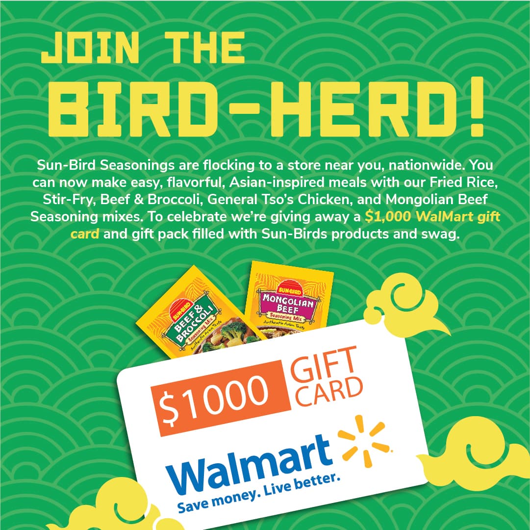
 SEO + Social
Sweet Sensi
CBD E-Commerce Growth
500%+MRR growth
View Case Study
Case Study — Coinline Barcade · 2022
Named, designed, and launched from scratch — Beast built the full brand identity for Coinline Barcade, a retro-modern arcade concept built to own every surface it touches.
The Brief
A new barcade concept was coming to life — a modern bar and arcade fusion built around the authentic 80s and 90s arcade experience. The founders came to Beast with one clear vision: build a brand that doesn't just look like a retro arcade, but feels like one from the moment someone sees the logo on a t-shirt to the moment they walk through the door.
The brief wasn't just a logo. It was a full brand universe — name, visual identity, tone of voice, marketing strategy, apparel, signage, social presence, and a website that played like a game. Every consumer touchpoint had to carry the same electric energy: the coins, the cabinets, the crowd, the culture.
The competitive landscape was a clear opportunity. Most arcade bars in the market had minimal visual identity — generic neon signs and stock photography. Beast saw a wide-open lane to build something that dominated visually and set a standard for what a modern arcade brand could look like.
No name. The founders had a concept, a location, and a vision — but no brand name. Beast had to start from zero.
Dual audience. The brand needed to resonate with nostalgia-driven adults who grew up in arcades AND younger audiences discovering arcade culture for the first time.
Experience brand. Unlike a product or service, an arcade barcade is the experience. The brand had to work as environmental design, wearable merchandise, digital content, and a physical space — simultaneously.
The Mark
The Coinline wordmark was engineered for motion from day one. Every letterform — geometric, modular, and pixel-exact — was designed to animate as fluidly as it prints. This is the logo in its element.
Our Approach
Before a single logo concept or color palette was touched, Beast went deep into arcade culture — the history, the language, the iconography, the community. What were the authentic signals that dedicated arcade players would recognize? What were the visual codes that defined that era?
The research pointed toward three design pillars:
Pixelated Graphics
Pay homage to old-school gaming and the art style of the era. A cultural signal, not just decoration.
Gaming Elements
Specific, considered references from arcade culture — not generic game controllers slapped on a logo.
Modern Typeface
Contemporary typeface design to give the brand an updated feel. Retro-modern, not retro-only.
Beast ran through a full naming exercise — dozens of candidates across multiple naming frameworks: descriptive, evocative, abstract, cultural reference, invented. The criteria were strict: relevant without being generic, scalable beyond a single location, memorable and ownable, works visually as a logo, and ambiguous enough to intrigue people who don't know the reference.
One name kept rising to the top: Coinline.
A coin line is a line-up system from classic video game arcades — the method by which players reserved their spot on a high-demand machine by placing coins on the cabinet's bezel. It's a piece of genuine arcade culture: tactile, competitive, social, and completely specific to the era.
Why It Works
People who know it immediately feel the nostalgia. People who don't know it still understand the concept instinctively — coins, line, waiting to play. It's short, brandable, and looks exceptional as a logo wordmark.
Coin + Line = Coinline.
With the name locked, Beast designed a custom logo wordmark built around three forces working together:
Pixel Architecture: The letterforms incorporate pixel-level geometric cutouts and structural elements that reference 8-bit and 16-bit era graphics without being a literal pixel font. The "O" in Coinline features a centered square detail — a subtle coin icon embedded directly into the wordmark.
Custom Typeface Treatment: The base letterforms are drawn custom with angular cuts, geometric precision, and a lowercase treatment that feels modern and approachable while the structure feels engineered and sharp. This isn't a font download — it's a designed system.
Flexibility Built In: Beast designed the logo to work across every surface the brand would touch: neon signage, embroidered apparel, digital screens, printed tokens, merchandise. Eight logo variants were developed covering every use case.
Every creative decision traces back to a specific visual source. Click or tap each card to see what shaped the Coinline logo system and why.
Tap a card to expand
The brand color palette was built to capture the visual language of arcade culture at its peak — neon-lit, high-contrast, electric. Click any swatch to copy the hex code.
The brand voice was defined as: Nostalgic but Never Dated. Playful but Never Childish. Confident but Never Exclusive.
Insert Coin
Gaming language used naturally, never forced
Play Together
Community-first; arcades are social
Level Up
Growth, improvement, beating the high score
Old School Soul
Authentic reverence for the culture
What We Built
When the six-month brand development sprint was complete, Coinline had a full brand system ready to deploy — not just a logo, but a living identity that could scale.
Brand Name & Strategy
The name Coinline, its rationale, cultural positioning, and competitive differentiation — documented so every team member and partner can communicate it consistently.
Complete Logo System (8 Variants)
Base wordmark, full color with BARCADE descriptor, dark/light versions, B&W, horizontal lockup, CL22 shorthand mark, and stacked variant.
Visual Identity System
Color palette with exact values, typography system, graphic texture library (pixel grids, geometric patterns, scan lines, triangle motifs), and photography direction guidelines.
Apparel & Merchandise
Launch apparel collection including the signature CRT-inspired geometric triangle pattern — designed to be worn by staff and sold as merch, marketing the brand every time worn in public.
Digital & Social Foundation
Platform setup strategy, profile optimization, content pillars, and the foundational 90-day content calendar covering Instagram, Facebook, and gaming-culture platforms.
Website Architecture & Strategy
Full site architecture, content strategy, and design direction built to function as an interactive brand experience — not just an information page.
Go-To-Market Plan
First six months of brand launch: SEO/SEM foundation, community integration strategy, relationship-building with industry partners including Arcade1Up, and the event framework for opening-week foot traffic.
The Results
Coinline launched with a brand identity strong enough to command attention before a single cabinet was plugged in. The visual system did what great brand design is supposed to do — it communicated the entire promise of the experience in a single glance.
Zero to Recognizable — Starting from a concept with no name and no visual identity, Beast delivered a complete brand system that looks like it has been operating for years.
Community-Ready — Coinline's grounding in real arcade culture — the coin line system, pixel-era aesthetics, authentic gaming references — gave it immediate credibility with the audience it was designed to serve.
Scalable System — The logo variants, color system, and graphic library were built to scale from a single location to a franchise. Every future application has clear direction without requiring another full design engagement.
Merchandise That Markets — The apparel design system turns every staff member and loyal customer into a walking billboard. The geometric pattern works as a standalone graphic without the wordmark — a mark of a truly mature brand identity.
"I came to Beast Creative with just an idea. They helped turn it into a full brand — logo, voice, website strategy, everything. What I have now isn't just a product, it's a brand people connect with. I couldn't have built this without them."
Insert Coin
Game-aware language, used naturally
Play Together
Community-first messaging
Level Up
Growth and competitive spirit
Old School Soul
Authentic cultural reverence
Whether you have a name or just an idea, Beast builds brand identities designed to last. Let's talk about where you're starting and where you want to go.
See Where You Stand in AI Search